General Information
*Required FIelds
Are you interest in
Choose a service
Budget
Write what we need to know about your project
Send
Thank you! Your submission has been received!
Continue
Oops! Something went wrong while submitting the form.
Close icon, svg, gray
Project:
Airba pay
Type:
The website

Airba pay

Airba pay
Services
UX-Research
UX/UI-Design
Technology Stack
Figma
Task
Bring Airba Pay’s scattered pages together into one main page and clearly explain its two key products — installment payments and online acquiring — at a glance. Preserve the logo color and build a cohesive visual system around it.
Solution
We built the flow around: “what it is → why trust it → which product fits → how to connect.” At the entry point, we combined everything into one core offer with a clear CTA, then followed with benefits and proof points, product selection, and a final contact block.
Services
UX-Research
UX/UI-Design
Task
Bring Airba Pay’s scattered pages together into one main page and clearly explain its two key products — installment payments and online acquiring — at a glance. Preserve the logo color and build a cohesive visual system around it.
Technology Stack
Figma
Solution
We built the flow around: “what it is → why trust it → which product fits → how to connect.” At the entry point, we combined everything into one core offer with a clear CTA, then followed with benefits and proof points, product selection, and a final contact block.
Tag line, svg, white
Description
The hero section holds attention with a 3D object, and the rest of the page is built from repeating modules—visually consistent and easy to scan quickly.
We used generative imagery to cover the visual content without the cost of a full photo shoot; the “Who it’s for” section and the testimonials slider add engagement and keep users moving through the flow.
Airba pay
Airba pay
Airba pay
Tag line, svg, white
Process

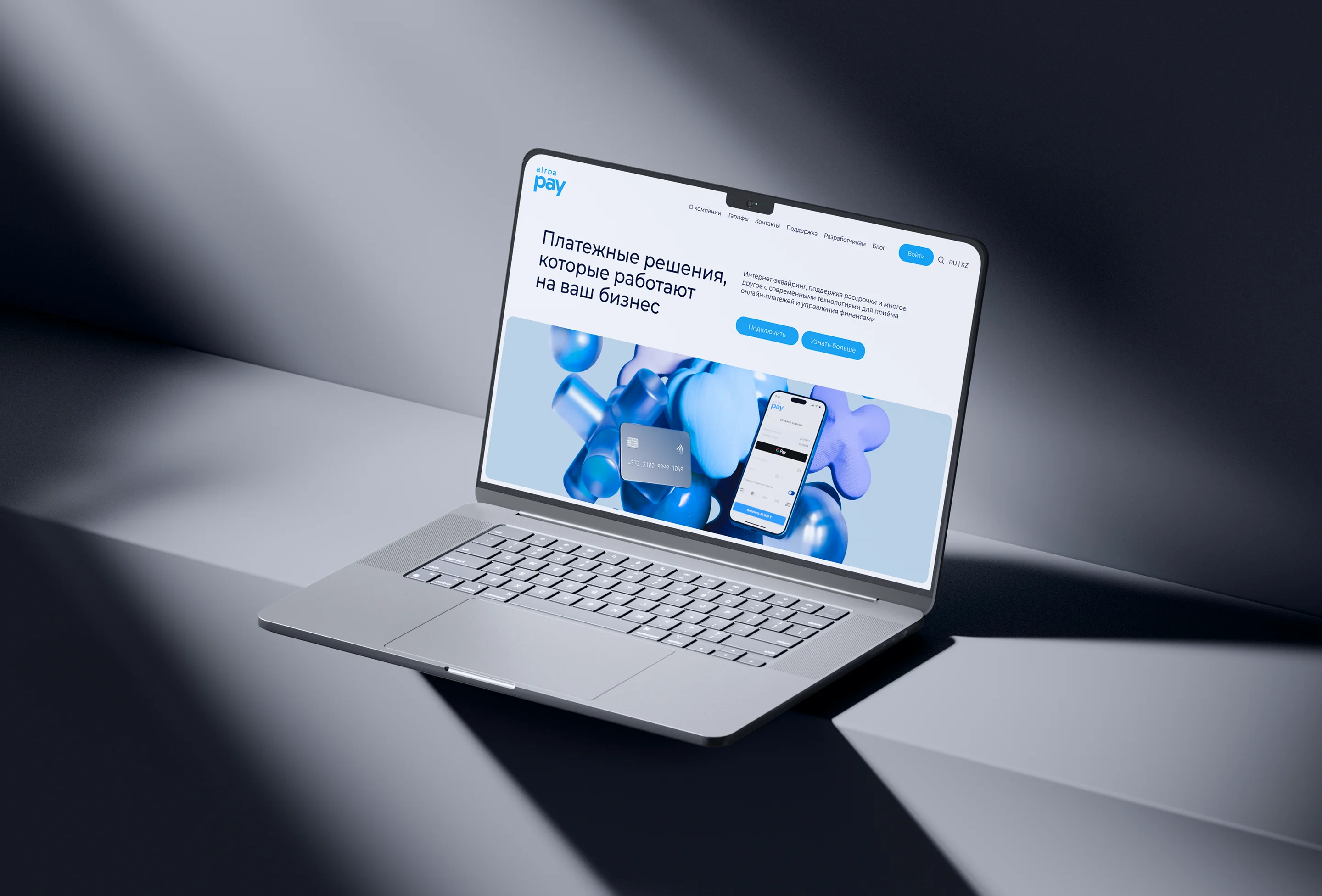
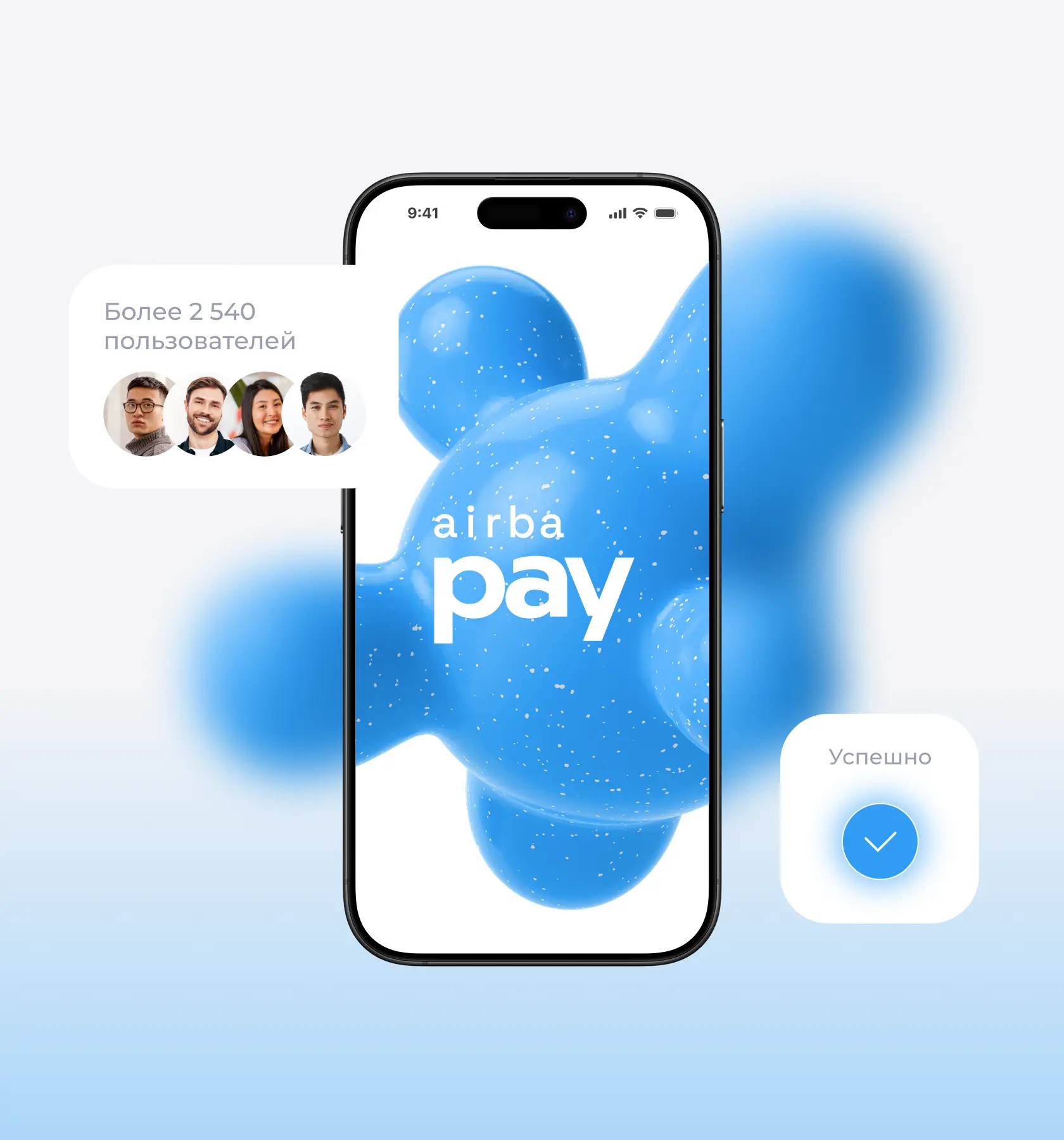
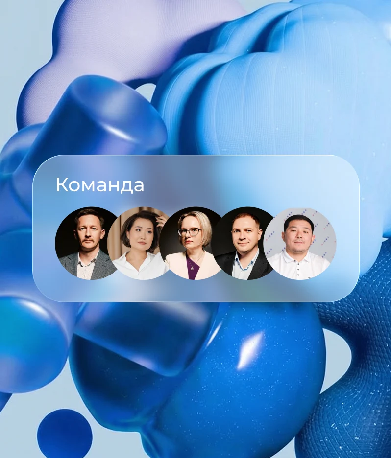
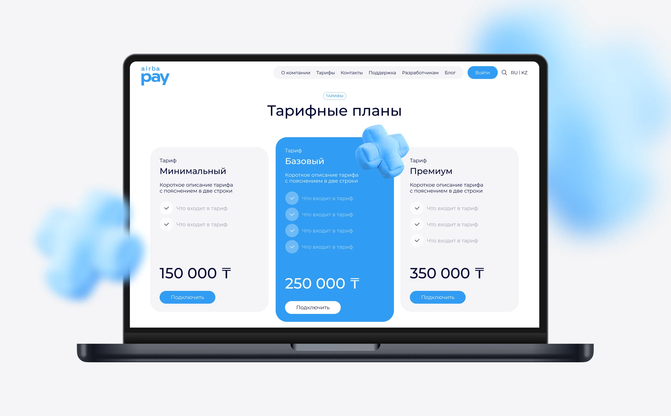
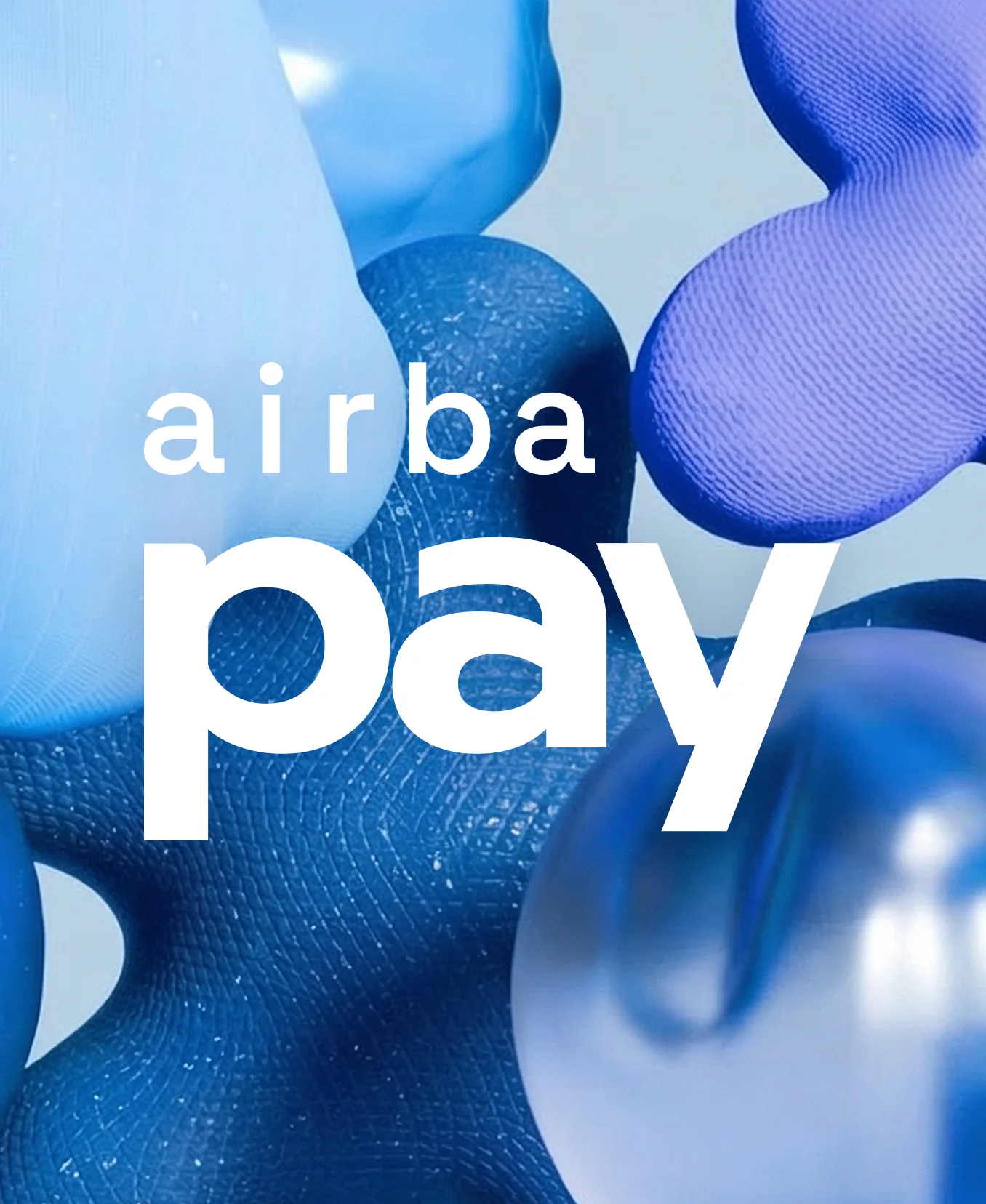
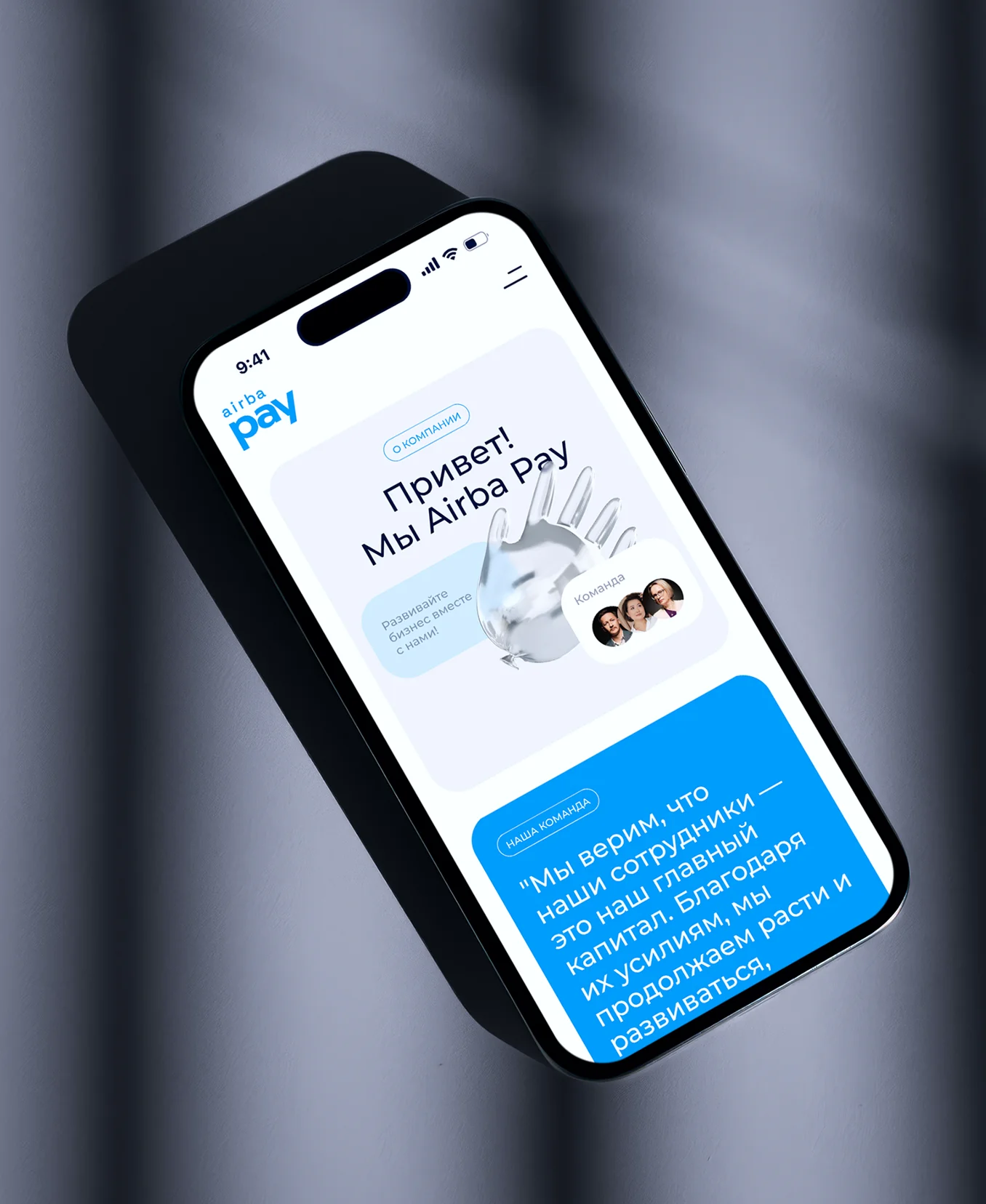
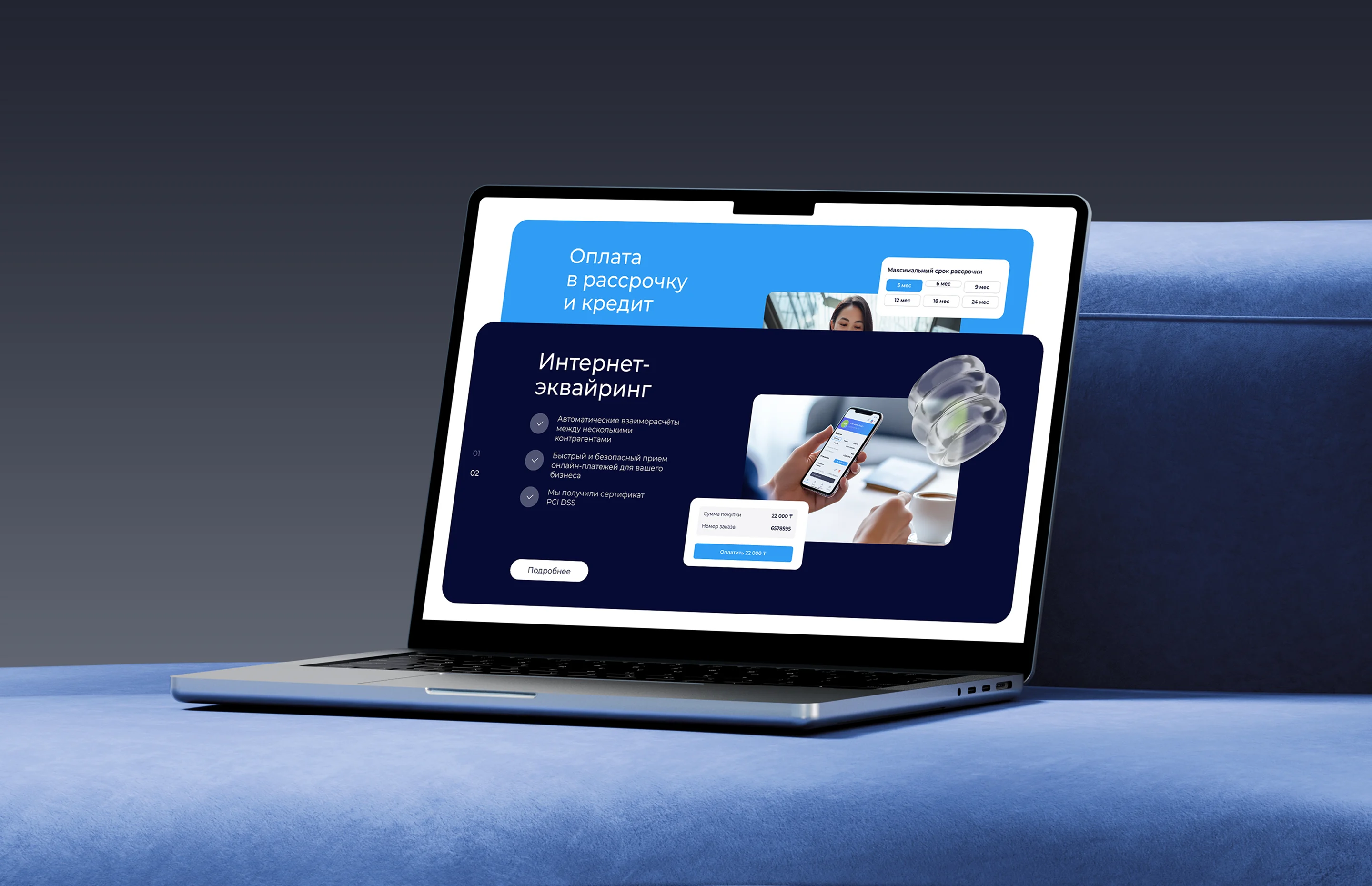
We started with a prototype and a user journey map, then moved on to design and development. The homepage took the longest to refine because of the 3D style exploration; the visual system was built around the logo color, and the content was completed with generative imagery.

Airba pay
Airba pay
Airba pay
Tag line, svg, white
Result
The homepage works as a product showcase: it quickly explains what to connect, removes doubts, and leads the user to contact. Thanks to the clear flow and supporting proof points, users spend less time figuring things out and reach the CTA faster.
Airba pay
Next Project
UX-Research
UX/UI-Design